
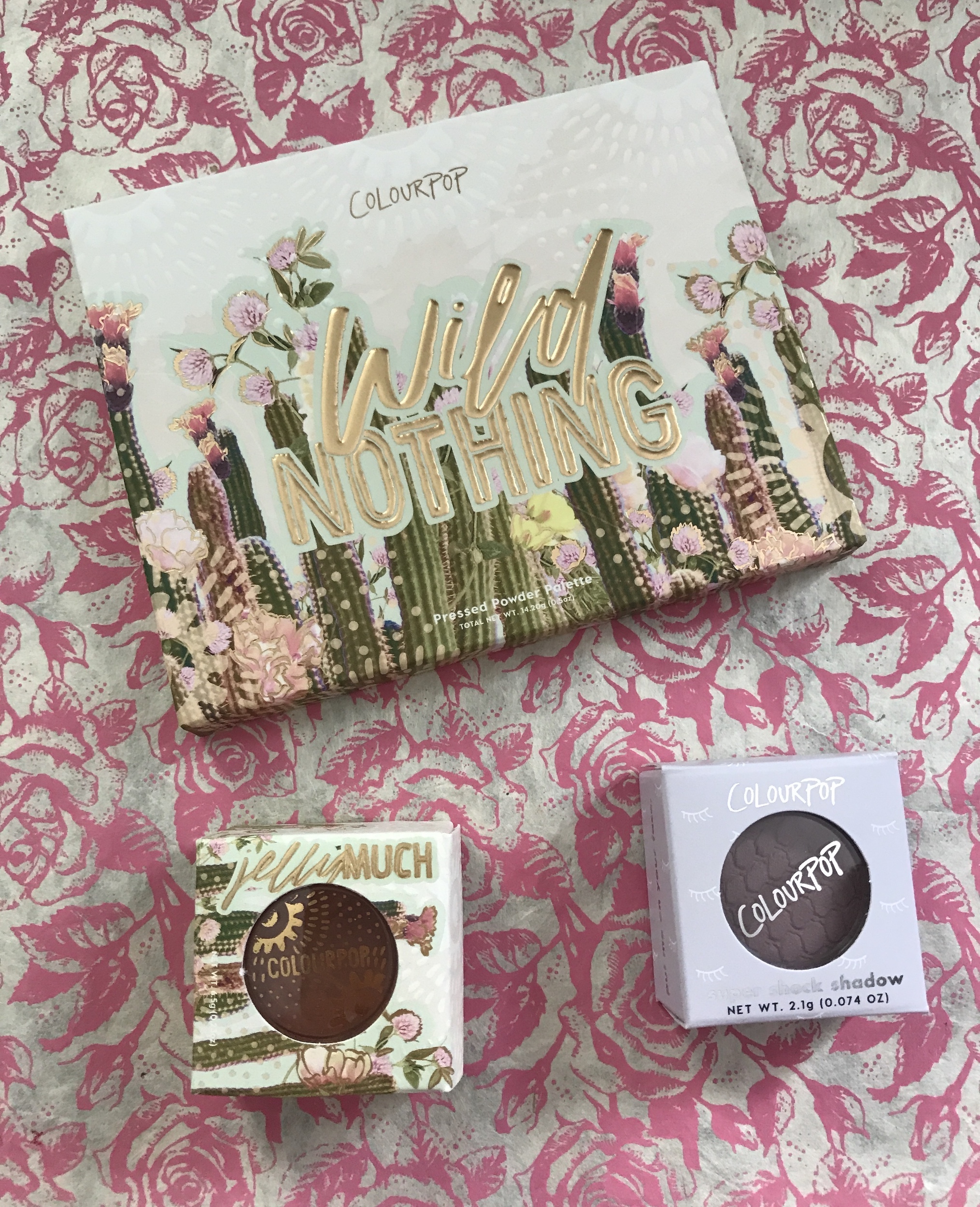
ColourPop Wild Nothing Shadow Palette
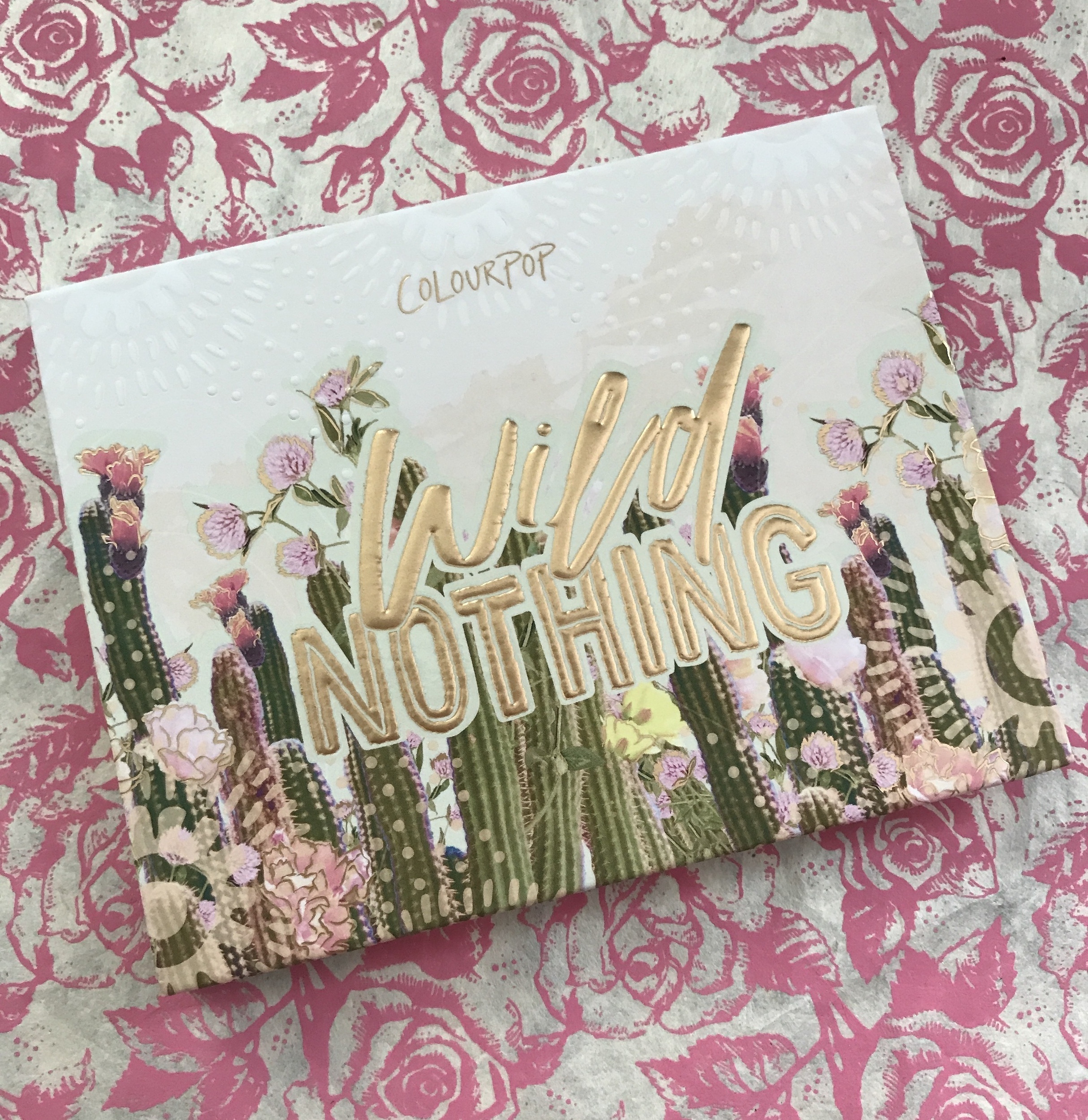
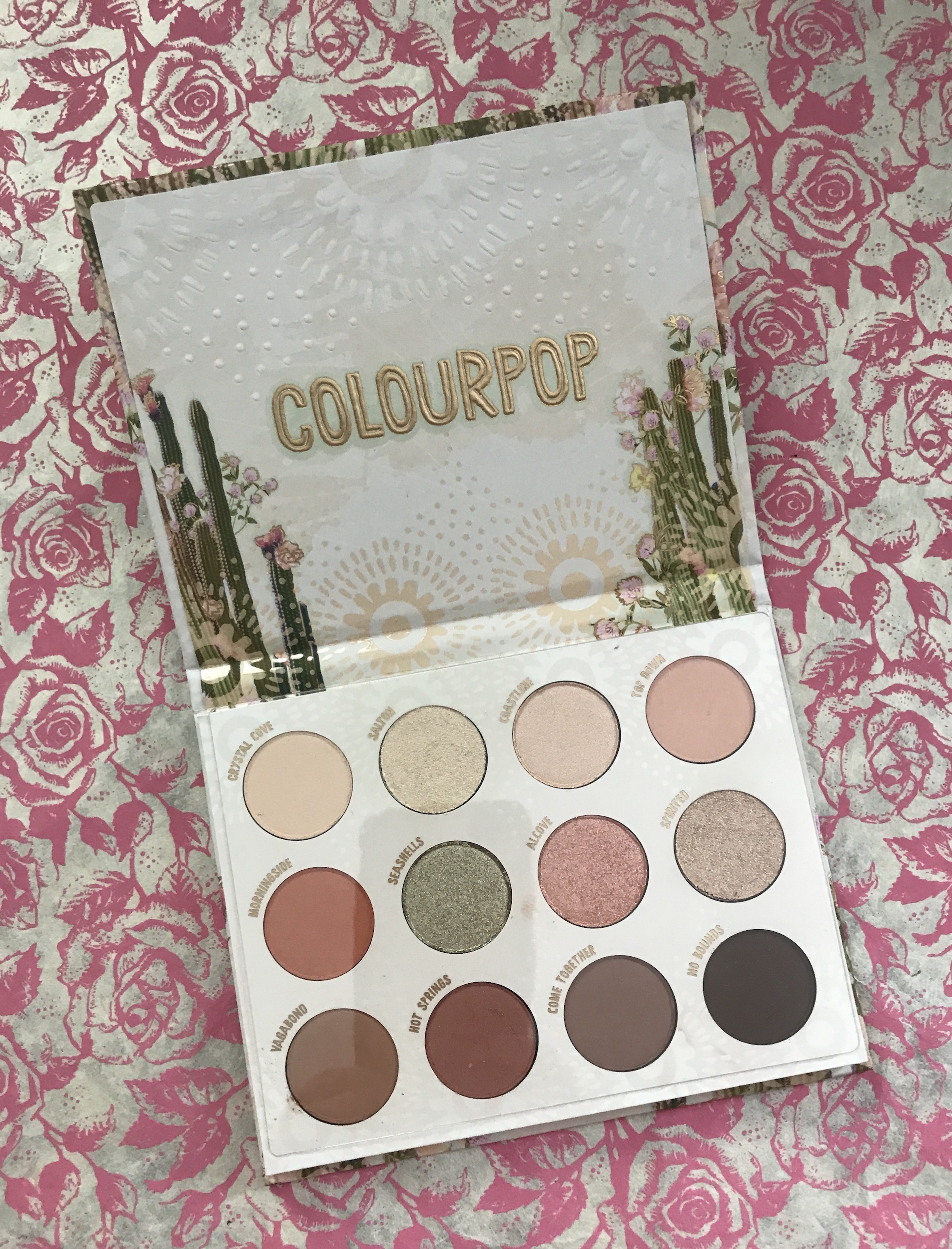
It has been ages since I bought anything from ColourPop. So when I saw photos of their new-ish Wild Nothing Shadow Palette, I decided to give it a try. Wild Nothing is a peachy/neutral pressed powder palette made up of mostly light-colored mattes and shimmer shadows, a mix of warm and cool tones for natural-looking eye looks. There are 7 mattes and 5 shimmers, I think.
Although they kick up quite a bit of dust in the pan, they seem to be fine on the skin. In other words, no fallout in spite of the dusty pans. I applied them over Urban Decay Anti-aging Primer Potion because they are so light in tone.
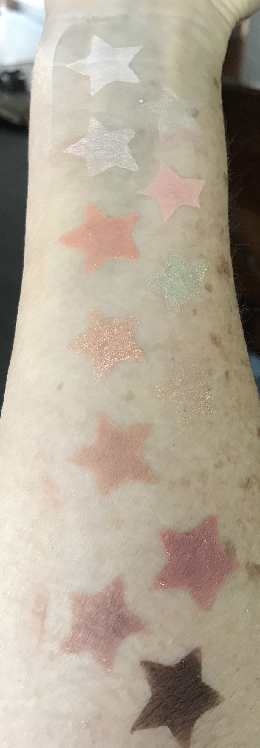
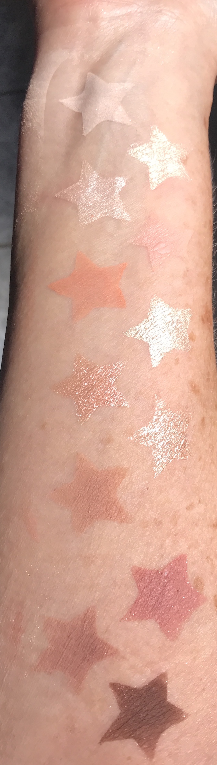
Usually peachy neutrals suit me, but because quite a few of them are so close to my skin tone, some of them are hard to see. The pigmentation is decent, but I think these shades might look better on deeper skin tones where they would show up better. One of the shades, Spirited, is almost invisible on me except for a bit of a shimmer. The shimmer shade I was most interested in, Seashells, that I thought was a shimmery light green/bronze is a disappointment. In the pan, it looks great. On my skin, Seashells is a nondescript ivory shimmer. A few other shades are just about invisible on me unless the sun hits them just right. Nevertheless, the shadows blend well and wear decently over primer.
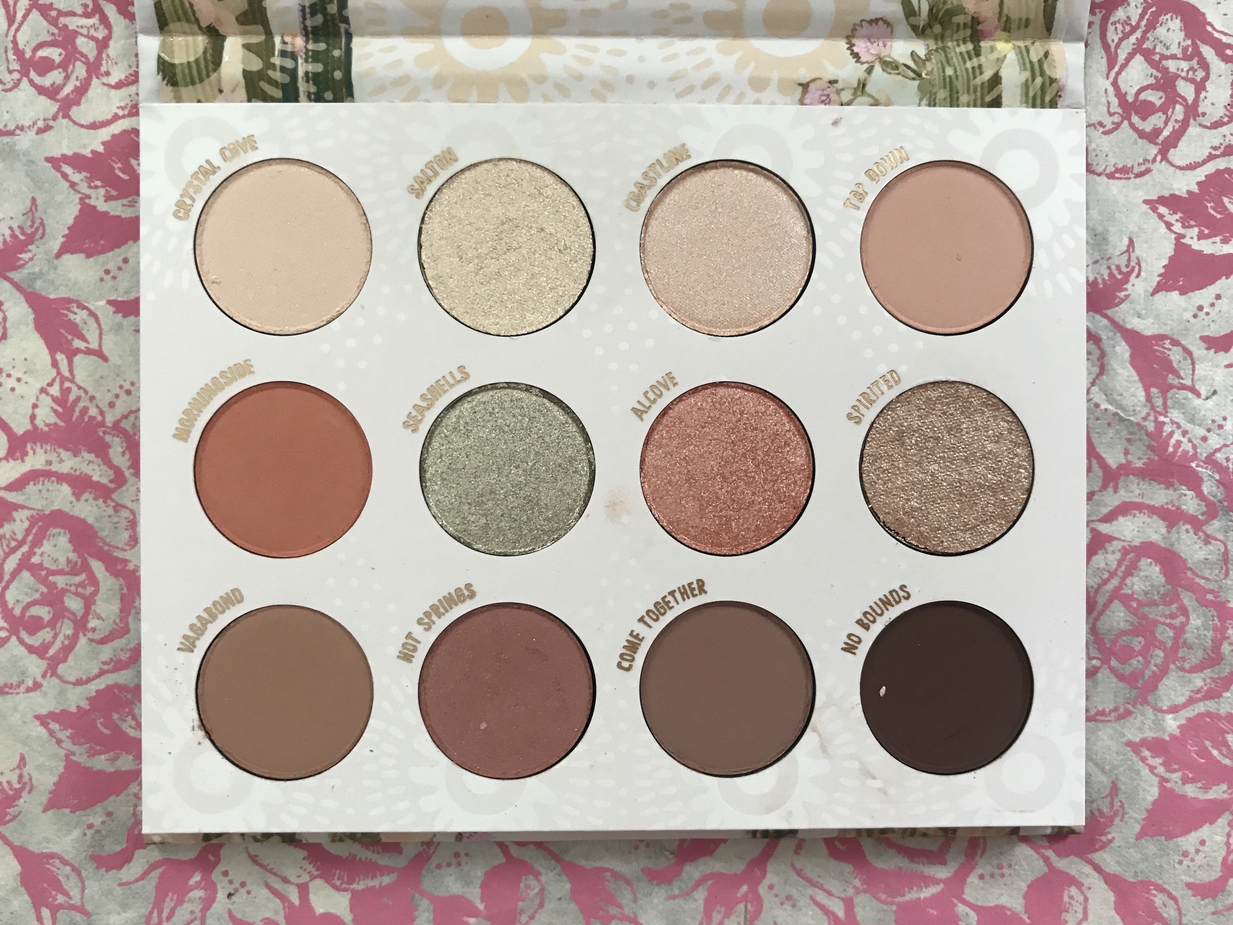
The Wild Nothing shade descriptions from ColourPop are:
- crystal cove: matte warm ivory with pinpoints of silver and gold pearl: looks like plain matte ivory to me
- salton: white gold with pinpoints of gold and silver pearl
- coastline: metallic icy tangerine
- top down: matte peach: one of my favorite shades in the palette
- morningside: matte muted peach: another favorite that I’d describe as browned-peach
- seashells: metallic icy moss with pinpoints of silver pearl: my big disappointment
- alcove: metallic icy orange with pinpoints of silver and pink pearl
- spirited: warm taupe with pinpoints of silver and gold pearl: almost invisible
- vagabond: matte warm saddle brown
- hot springs: soft matte berry with pinpoints of silver and gold pearl: very pretty shade but again where are the pin points?
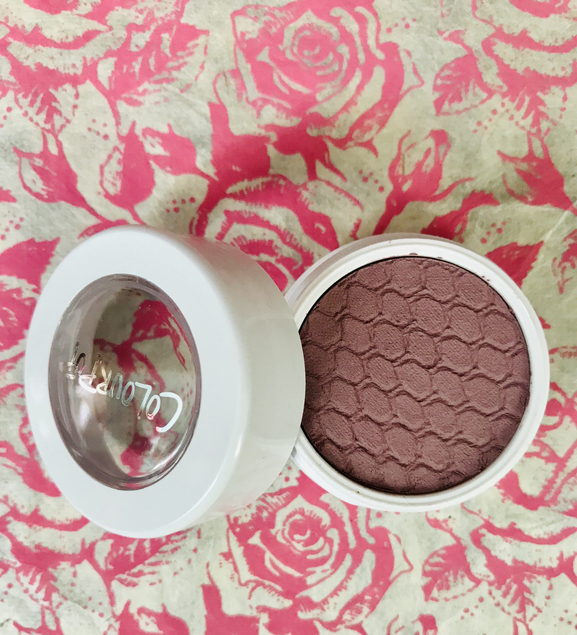
- come together: mid-tone matte brown: a good shade for the crease
- no bounds: blackened matte brown: a good shade for the outer-V for me
So, I don’t see any of the “pinpoints”, just shimmer.
Here are the swatches, first indoor light where the 2nd, 6th and 8th shades hardly register:
and second in the sun that helps some of the shades show up better:
My assessment is that this is a good daytime neutral palette for natural looks, especially good for spring and summer. It reminds me of the Too Faced Peach palette that came out a couple of years ago, but less pigmented. I think going forward I will probably use the matte shades that have more of a presence on my skin than the shimmers. I’ll use the shimmers just for a glow in the center of my lid.
I may be alone in my criticism of the shades because all 15 of the customer reviews on the ColourPop website give this palette, described by several women as “simple” (I think they are right), 5 stars. $18
Today, I’m wearing Wild Nothing shades Top Down, Vagabond and Come Together.

They are pretty, but very light…too light for my skin tone. On a person with a darker skin tone, they might be absolutely lovely. But on me, they’re hard to see.
ColourPop Jelly Much Shadow: Mystical
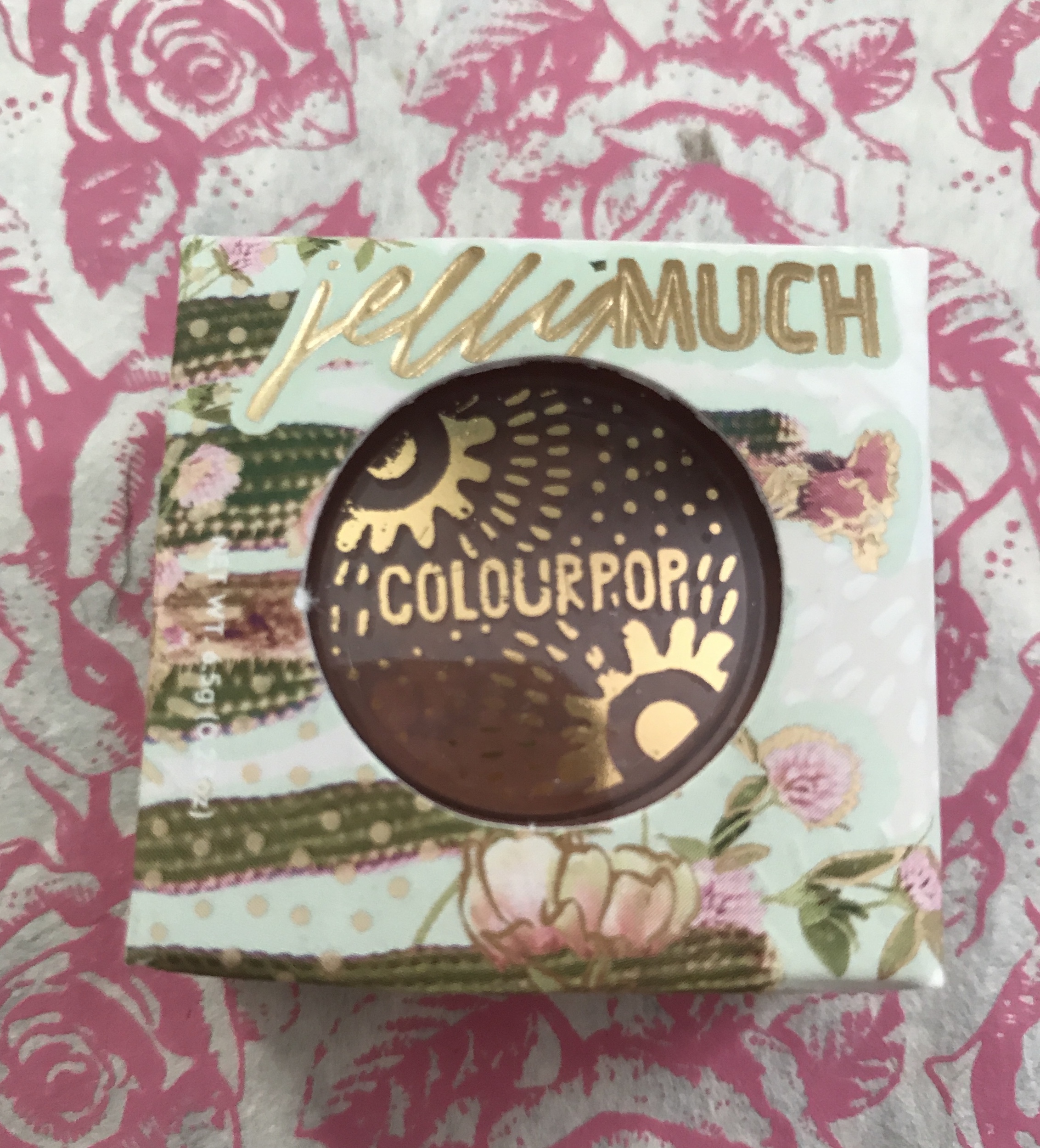
I have been wanting to try one of the ColourPop Jelly shadows since they came out a couple of years ago. Mystical is one of the two shades introduced along with Wild Nothing.
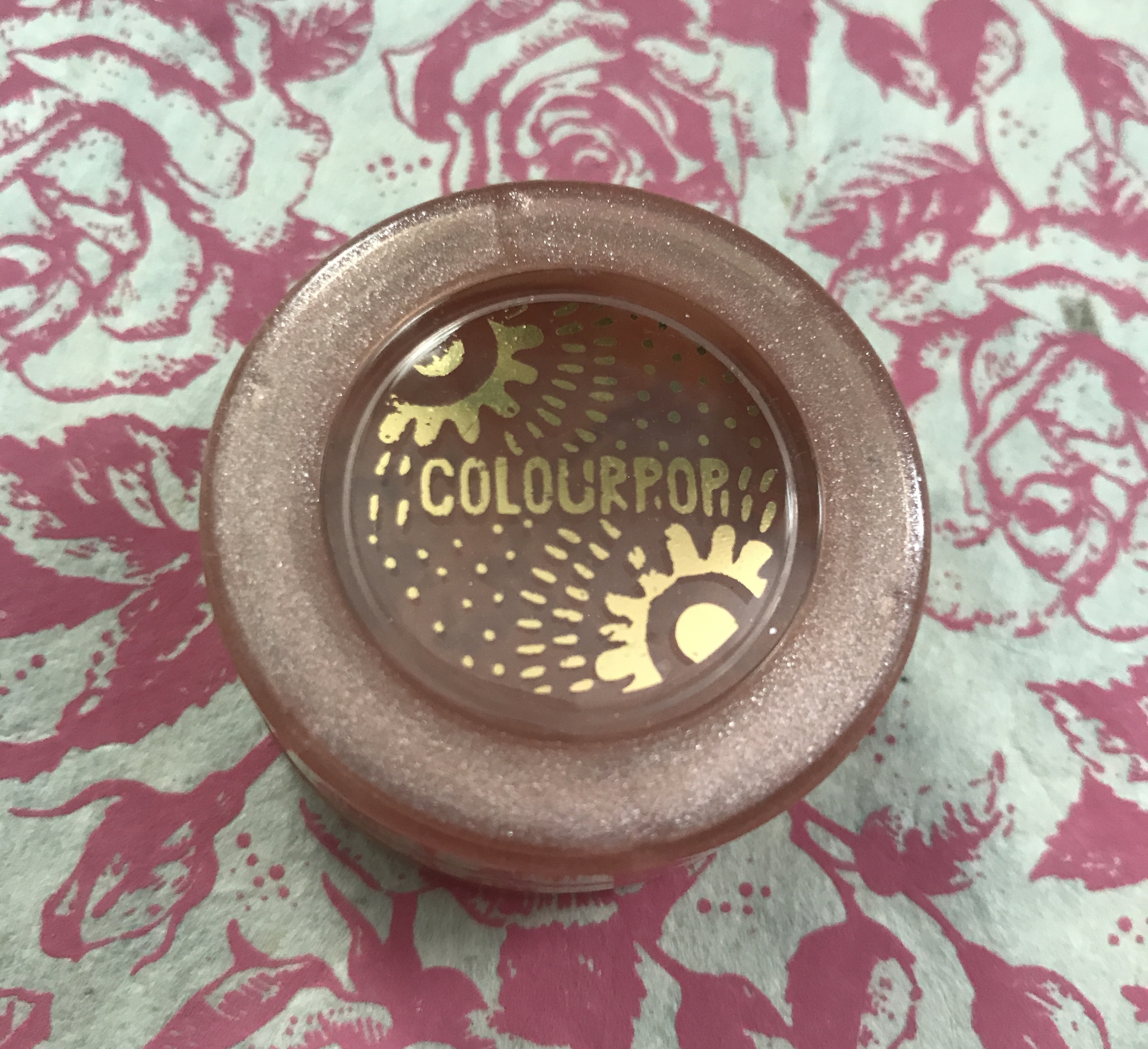
Mystical is supposed to be an intensely pigmented icy taupe with gold, pink, and silver glitter. In the pot, it sure looks promising!
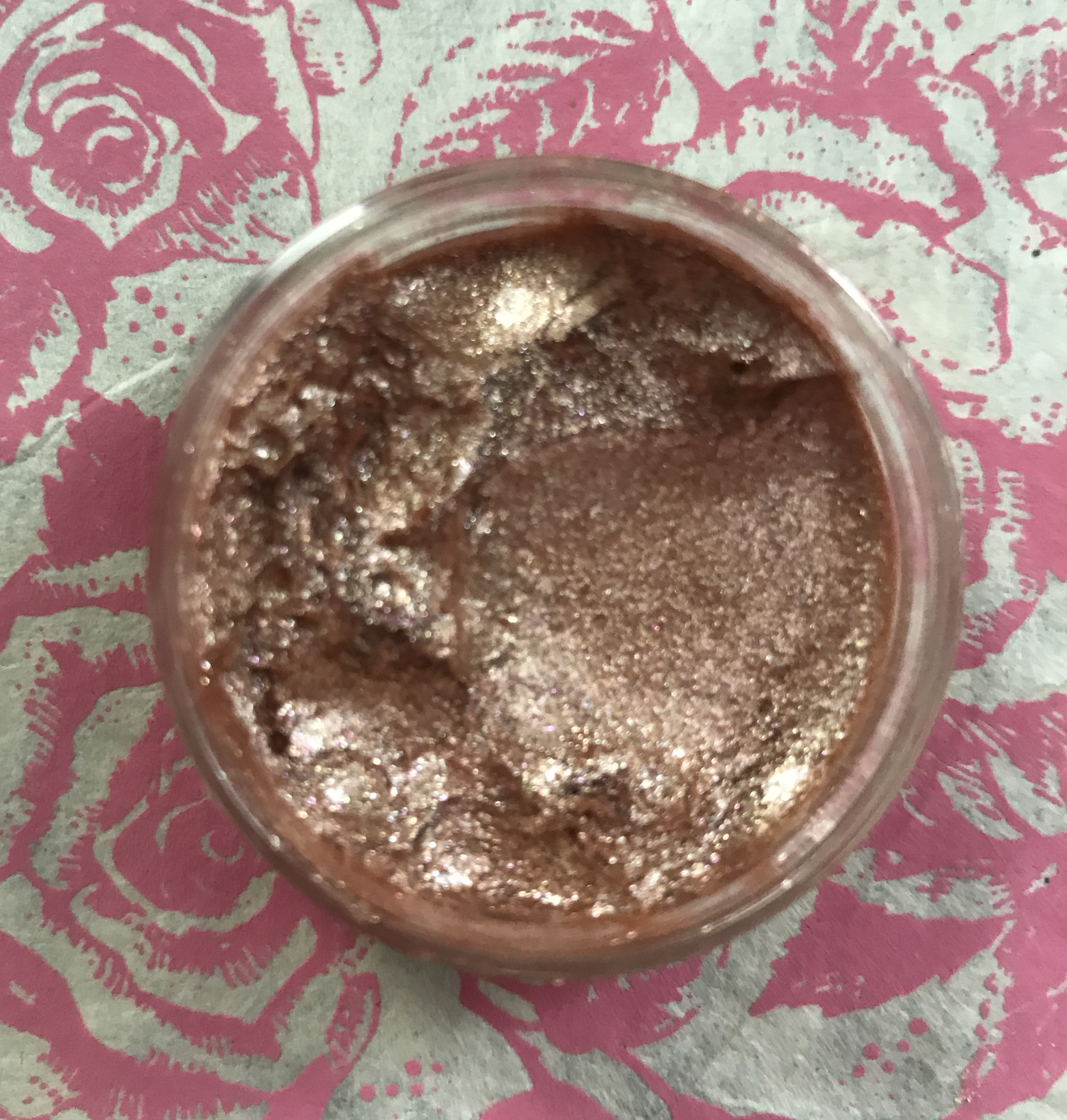
On me, I guess I would describe this as a generic translucent pale gold shimmer, very similar to the pressed powder shimmer shades in the palette. Boo, big disappointment. Again, I will wear it over matte shadows to give them a shimmer. Check out the swatch below along with the swatch of the much more intensely pigmented Super Shock Shadow, Bill.
I won’t buy another Jelly shadow. $8
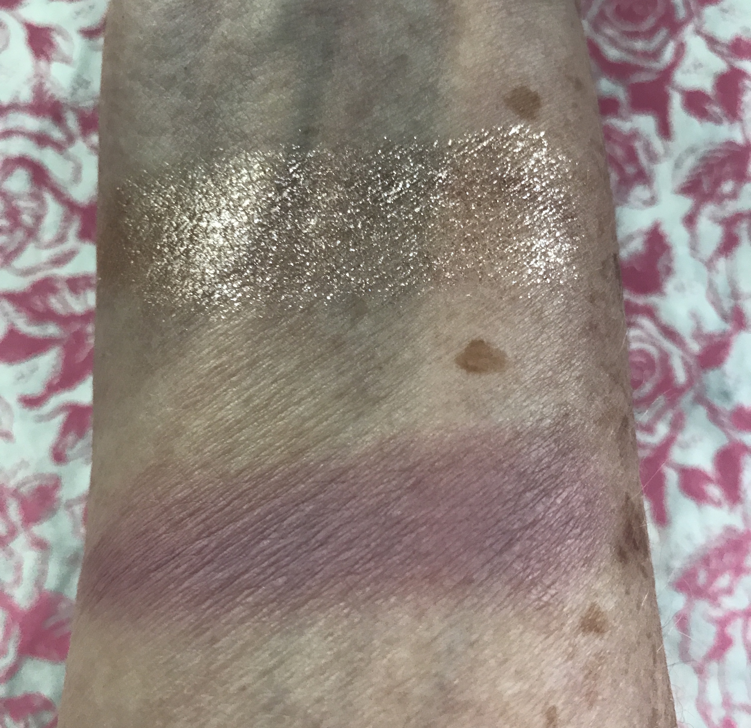
ColourPop Super Shock Shadow, shade Bill
I’ve been a fan of ColourPop Super Shock shadows for a long time. Bill, matte dusty mauve, turned out to be the star of my mini-haul. Bill is a gray-lavender shade, and a nice neutral for everyday. But where this shadow really excels is its long-lastingness. I swatched it on bare skin and took a photo of it. Then, I tried to wash it off with soap. It didn’t budge. It was still on my arm 3 days later! I love the Super Shock formula! And Bill is a great addition to my Super Shock stash. I find that if I close the pot tight, it doesn’t dry out. I have had some shades for 3 years. Yeah! $6


Bill is stunning! I love dusty mauve shades!
Lola Seicento recently posted…Shared Planet Sea Turtle Highlighting Palette | Review and Swatches
CP Bill, the dusty mauve is gorgeous on and it lasts and lasts and lasts!
Those are some gorgeous neutrals!
I’ve really been wanting this palette. I’m such a sucker for neutrals and peach shades. My skin is a bit more tan so I think these might show up better. I also like that super shock you got! Great taste!
I think you’re right, Claudia. The shades are so pretty, but my skin is just too light for about half of them. I think they’d be great on you
I can totally relate to shades that look promising in the case and on models but not showing up when applied. UGH…So disappointing! I also end up using them over other colors for a pop of shimmer. All things considered I’m glad you’re happy with an item from your haul! xo
Laura, I was so surprised that this ColourPop palette was such a disappointment. Their Fame palette that was discontinued several months ago is one of my all-time favorites. But after this, I will stick to their Super Shock shadows and blush and skip everything else. I think CP has too many launches. I’m sorry that you’ve had bad experiences with shadow shades in the past. I know that the days of makeup testers are over, but that sure is the best way to know if makeup is going to work. We’re now going to be taking chances for the foreseeable future. Hope you’re doing well, and having a decent summer, Laura xoxo
I agree, totally light even for my taste
I love their Super Shock Shadows, too, they’ve always worked well for my oily lids. I’m not really following Colourpop releases anymore because I’m overwhelmed by them tbh, but now and then a collection comes out that I covet. So bummed I couldn’t get my hands on any of the Sailormoon products 🙁
Glamorable recently posted…My Secret Crush: Olive Nail Polish
I agree with you about ColourPop: they have way too much going on. I hadn’t bought anything from CP in a year. Other than the Super Shock shadows and blush, I think I’m done.
These colors are very pretty on you!
Just before we got shut down I bought a golden/neutral palette but it doesn’t look that way on me at all. The colors are all much warmer on me than they appear in the pan. I sent it to a friend so this new palette wouldn’t go to waste. I don’t know that I’ll be buying Colourpop again though.
MarciaF recently posted…Go for the gold with Masque Bar Gold Foil
It’s funny because the ColourPop Fame palette is one of my all-time favorite palettes. But I know how you feel, it will be a long time before I buy another CP palette without seeing it in person.