
Before the holidays in December, I succumbed to an ad on Facebook from a Chinese brand of makeup that I had never heard of before, Florasis. But the makeup they were advertising was so gorgeous that I couldn’t look away. Of course, Facebook kept showing that ad in my feed just about every day.
I Bought This, Affiliate Links
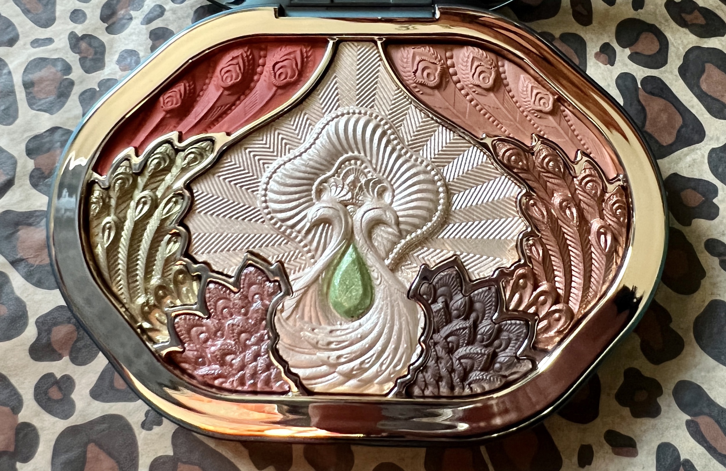
You may remember that I wrote about the limited edition Impressions of Dai Floral Engraving Forest Aura Makeup Palette soon after I received it (here) because the look of the palette and its packaging impressed me so much. Even the outer box that it arrived in was created with such beauty and care.
Florasis Dai Floral Engraving Forest Aura Palette Update
I’m still in love with the stunning case that the shadow palette comes in. For $59 which is not chump change, I bought the Dai palette that came in a plastic case. The more expensive version in a metal case had already sold out.
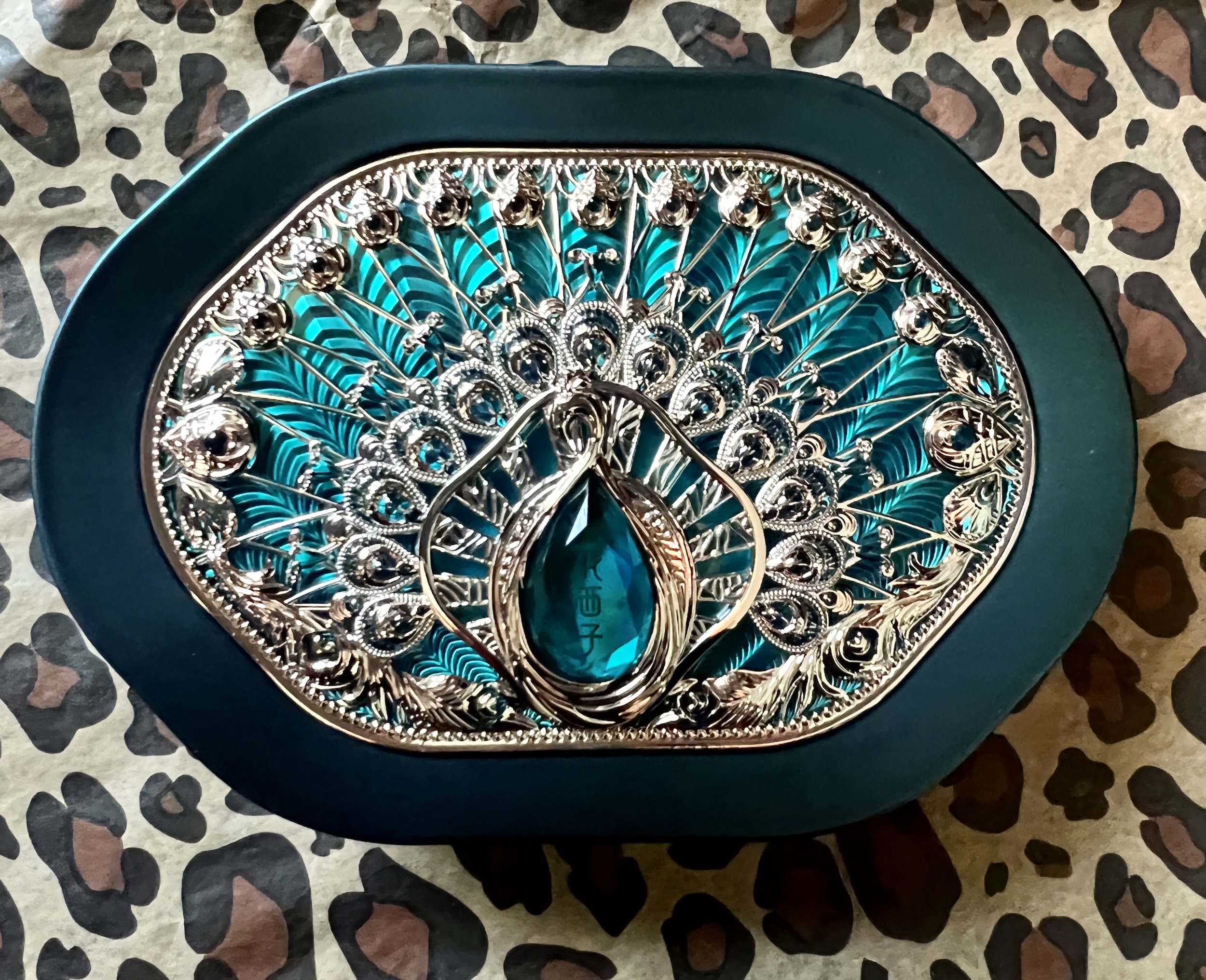
Honestly, I enjoy just looking at the case. Oftentimes, I leave it out on my vanity as decoration. The teal and gold peacock case cover is so eye catching. I even love the gold “lock” that helps me open and close the magnetized compact. Everything about the case is lovely.
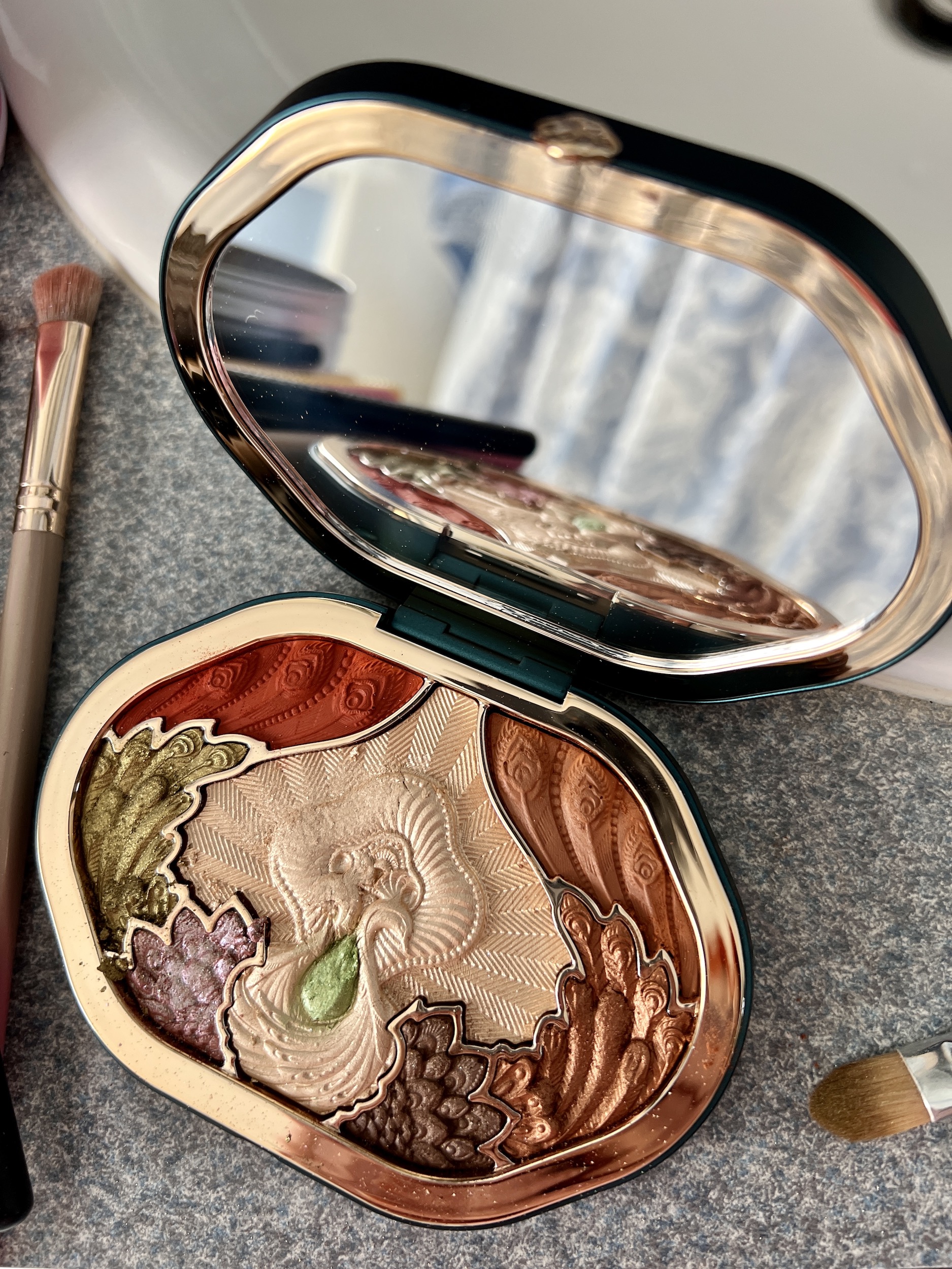
But the engraved shadows inside are la pièce de la resistance! The pans that hold the individual shadows are separated by gold to match the trim of the case. The full size mirror is high quality and has no distortions.
As I mentioned in my first post about the Dai palette, my friend Erika said she wouldn’t use the palette, but instead she “would keep it as a pet”. Though that’s how the palette functions most days as it sits on my vanity table, I decided that I had to use it, too. If it’s good stuff, hopefully Florasis will have something equally appealing next holiday season.
Swatches from the Florasis Dai Forest Aura Makeup Palette
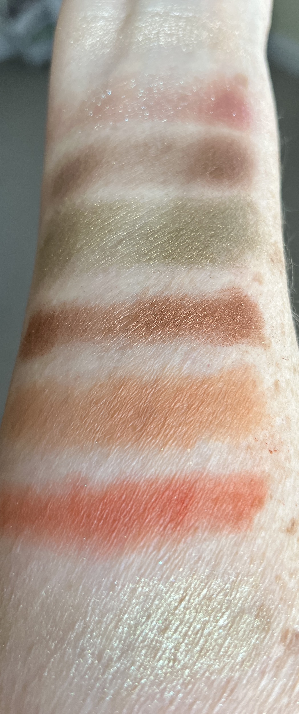
Below are the swatches in sunlight and daylight from the Forest Aura palette applied over Urban Decay Anti-Aging Primer Potion. I didn’t realize that the pans were identified with numbers on the back of the compact. If I had seen that, I would have swatched in that order. Instead, I started in the middle and moved somewhat randomly around the palette.
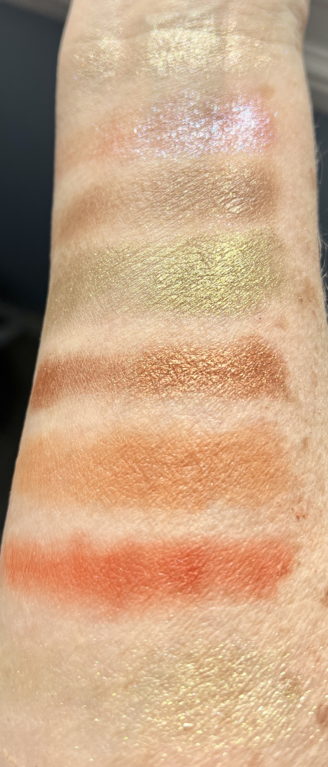
The palette has 8 shades: 4 shimmer shadows, 1 duochrome, and 3 matte shadows.
Here are my descriptions of the shades:
- champagne shimmer: this pale shimmery gold takes up the most real estate in the palette and forms the middle of the design
- purple-red duochrome with a turquoise shift: this was a surprise. I didn’t realize the palette had a duochrome.
- milk chocolate brown matte (it looks shimmery in the swatch, but it isn’t): a nice medium brown that’s good for the crease, the V or for a neutral look
- deep green-gold shimmer that I would call “bronze”
- copper penny shimmer
- muted orange matte
- bright orange matte
- pale spring green shimmer
My Thoughts on the Shadow Shades
Because the champagne shadow took up so much space in the palette, I expected it to have more pizzazz. Instead, it is quite pale unless I’m in the sunlight when it stands out more. Though I can use it on the brow bone, in the inner corner or on top of one of the orange mattes for a little shimmer and brightness, on its own it doesn’t show up very well on me because it is close to my skin tone. I will try it next time over Anastasia Beverly Hills Shadow Primer that has a bright white base, and I think that might make a difference. Nevertheless, I think this champagne shade would be more successful and appealing on someone with darker skin where it would really pop.
As I said above, the duochrome came as a complete surprise. I expected the pan on the lower left below the center medallion to be a light cocoa rather than a purpley-red with a turquoise shift. So far, I have discovered that the duochrome doesn’t pack much of a punch. Instead, it is muted, unlike a similar shade that I bought from Danessa Myrick that is very pigmented and stands out perhaps a little too much on a mature woman like me. So the upside may be that I will wear the Florasis duochrome more often for a wash of purple with an aqua shimmer rather than strong shifting pigment.
My two favorite shades are, not surprisingly, the bronzy green-gold shimmer and the copper penny shimmer. They are both very nicely pigmented and beautiful. Perfect shades for me.
I will wear the muted orange matte along with the milk chocolate matte fairly often when I want a neutral matte eye. I can even use the bright orange along with the two mattes I mentioned. In the center of my lid, the bright orange intensifies the blue of my eyes.
So far, the key disappointment is the spring green teardrop pan in the middle of the two peacocks. Sadly, it is so pale, it’s almost nonexistent on me. Because it’s the smallest pan, it’s a bit difficult to get into. Maybe as I wear it down a bit more, the true green color will emerge. The pans seem to have a light coating on them that once the brush goes through it, it picks up more pigmented color. We’ll see if that happens with the spring green. Like the champagne, the pale green might be more attractive on darker skin.
My Thoughts on Application and Wear
What has amazed me most about the Florasis Dai eyeshadows is that they are not at all powdery. They do not get all over the palette or all over my skin. They shadows stay put on the brush and on my eyes.
Although I wasn’t able to find the ingredient list for the Dai Forest Aura palette (it isn’t sold on its own any longer, only as part of an Impression of Dai set), I did find the ingredient list from a similar Florasis shadow palette. The shadows aren’t powdery because they don’t contain talc. Yay. Instead, mica is the first ingredient, and there’s no talc at all.
When I wear the Forest Aura shadows, they stay put, and the colors remain true until I remove them 8 or hours later or even longer.
Final Thoughts
Although I wish a couple of the shades showed up on my light skin a little better, most of the shades that I bought the palette for wear very well on me. I’m very satisfied.
Importantly for me, the palette itself is so beautiful that it gives me joy to use it and just to look at it! So if you’re in the mood for a treat, check out the Florasis website. Look at the stunning carved lipsticks while you’re at it. I don’t think you’ll be disappointed.

Now that’s a palette that is eye-catching! The pressed design is beautiful as well as the casing. It’s always a shame when certain shades don’t work for us, but I typically find that with ANY palette I buy 😂 it’s very rare when I feel I can use every color. My daughter on the other hand….lol. Still looks like a very fun purchase!
The Florasis palette really stands out in a crowd! I am very happy with it. I agree with your POV, never does every shadow work!
That palette is so beautiful!!! Oh my stars!!! Sorry that some of the colors are disappointing, though.
Actually, it’s only the pale green that is really a disappointment. I’m enjoying using it anyway
That’s a good thing. I also hope that with time the pale green becomes more vivid.
So pretty! It’s art! I feel like I would have a hard time starting to use them. 😅 lovely colors!
I agree, Michelle, the ppalette is art! And it was difficult for me to start using it because I hated to lose the gorgeous engraving