If you follow such things, you are probably already familiar with Pantone’s Colors of 2021. They were announced at least a month or more ago, but I was so uninspired by their choices that I ignored them. But maybe that’s just me.
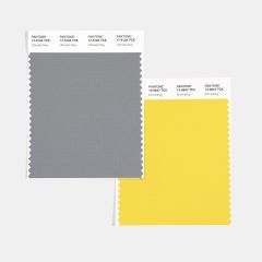
Pantone’s Colors of 2021 are Ultimate Gray and Illuminating:
- Ultimate Gray: a dull, lackluster shade of steel gray
- Illuminating: a bright, lemon yellow.
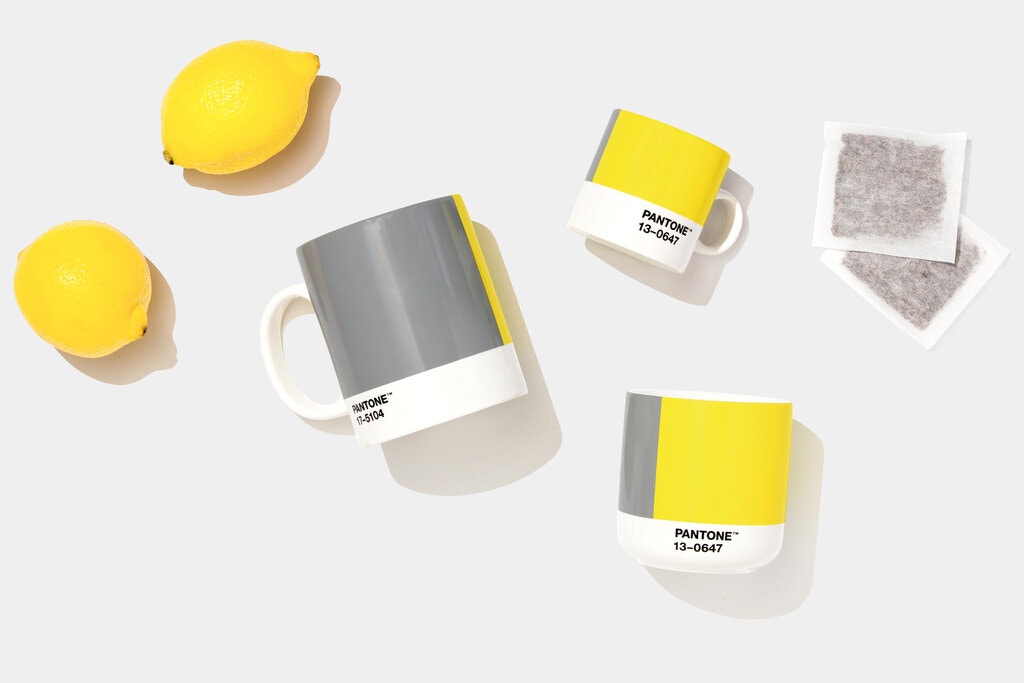
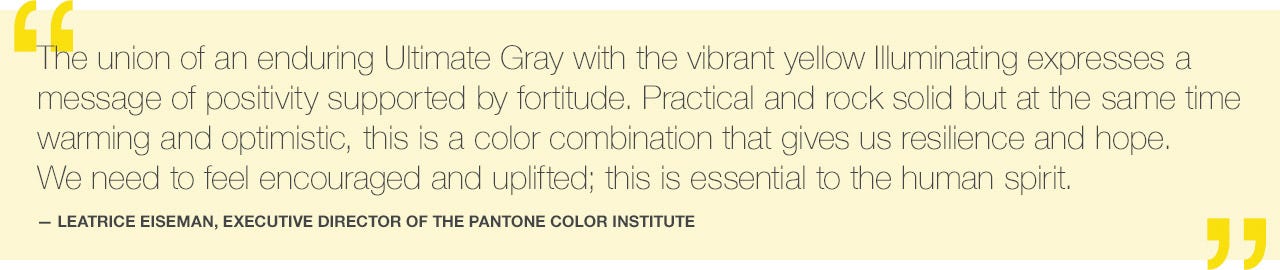
Honestly, I get why Pantone chose this duo. Obviously Ultimate Gray represents the horrendous year that we have just gone through and the continued difficulties that we are going through still. Illuminating represents the optimism and sunny skies that we hope are to come.
Nevertheless, I am so sick of seeing gray everywhere. It seems like every shelter magazine and lifestyle catalogue has been promoting gray interior walls and gray home accessories for the past 5 years as the “height of fashion”. Although I have been known to wear gray clothing as a change from black, I am happy to say I have no gray in my home at all. These last several years have been so gloomy that there is no way that I wanted gray in my personal environment. I hope I haven’t offended anyone because I know a lot of people love Crate & Barrel gray 😉
I have been on the fence about yellow just about my entire life. Although my mother bought me three yellow “party” dresses in 2nd, 7th and 8th grades (I guess she thought it was a good color for me, or else it was because they were on sale), I never really liked them. I believe I have one yellow 3/4 length sleeve t-shirt in my wardrobe, but I think that is it.
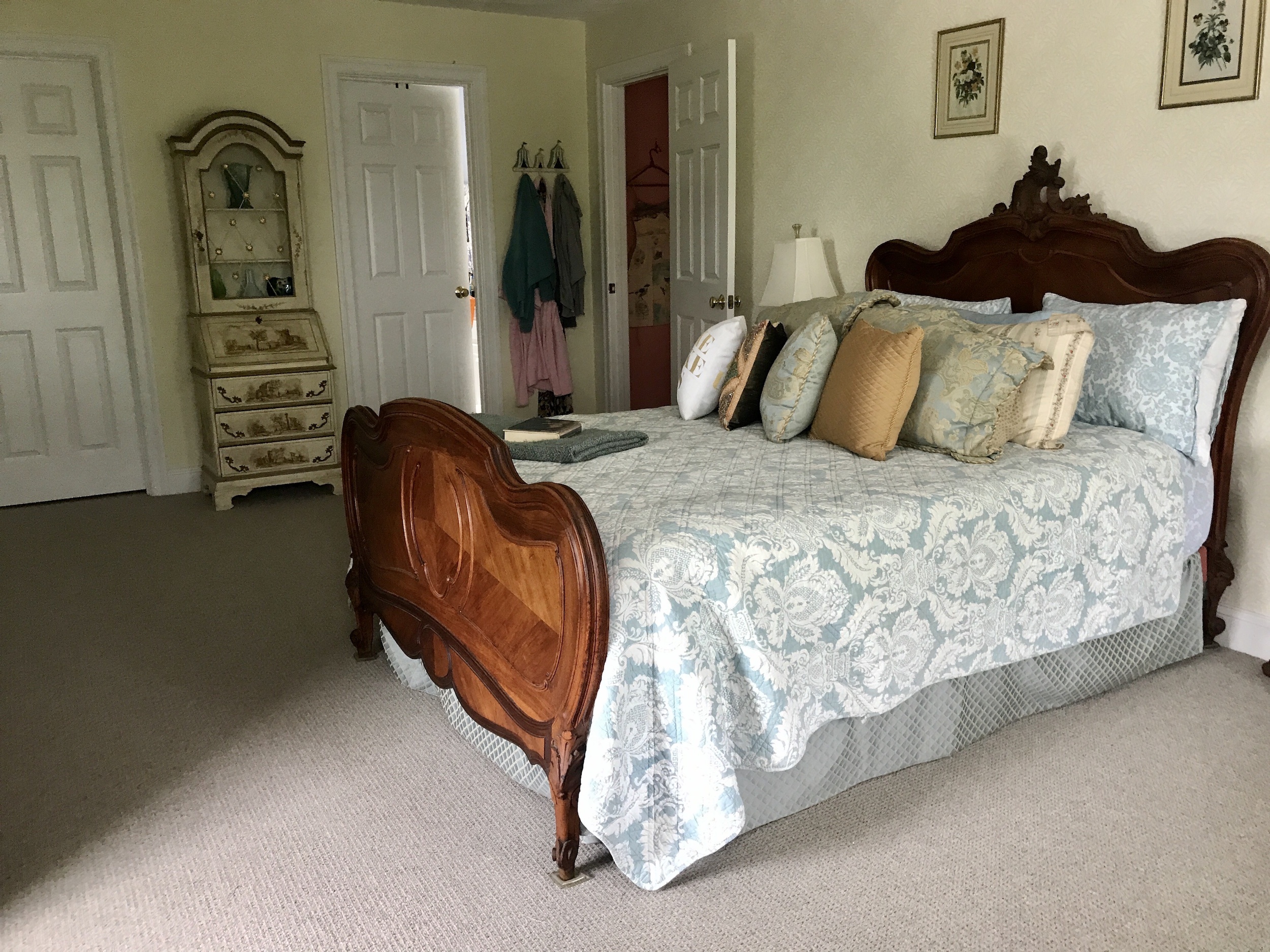
When I moved into my newly built house 20 years ago, I chose butter yellow for the walls of my bedroom. It was a surprising choice for me, but I still like it and think I made the right decision because it is such a neutral shade. It goes with the champagne metallic and pale aqua accent pieces that I chose to go with it.
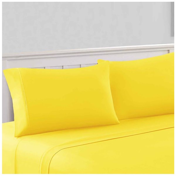
But lemon yellow like Illuminating, hmmmm. Here are some vibrant lemon yellow sheets on sale at Nordstrom! Fun, but I’m not sure I could sleep on this shade 😉
I do like some color combos with gray:
- pink and gray
- peach and gray
- even butter yellow and gray.
But I don’t like medium gray with screaming bright lemon yellow.
Some years, Pantone’s Color(s) of the Year have implications for makeup, and I must admit, I am a fan of gray eyeshadow. But I won’t be pairing it with yellow any time soon. Nail polish, maybe? Nah, not for me.
It will be interesting to see if bright lemon yellow starts showing up with gray housewares, furnishings etc.
So this is how I feel about Pantone’s Colors of 2021. But you may feel completely differently. Are you a fan of Ultimate Gray and Illuminating? Will you be taking color inspiration from this pairing? Do tell. I may have missed something, and maybe I need to change my mind!


I get why that made this choice as well! Let’s hope for sunny skies!
I’m not feeling the pantone colors in any way for myself. Not makeup wisie for sure. And Home? Well, my living room is more oatmeal/light browns. I have a few grey towels or throw blankets. That bright lemon yellow could be fun in someone’s very bright white and airy home, but not mine. Ours has warm colors for walls (brown upstairs)and I’m not really a “pop of color” person for home decor. Oh well!
I think your idea, Claudia, about bright lemon yellow accents in a white, airy beach house is right on. But I don’t have one, boo hoo, so no lemon yellow for me 😉
Uh, that’s a BIG no from me. I don’t mind a soft gray with some soft pastels but definitely no way would I decorate or wear anything in that “bright lemon” color.
Bright lemon yellow is a fun shade, but more for kids or teens fashion. I could see it a white walled, airy beach house for accent pieces, but like you, I’m not feelin’ it, Sandy!
I actually love these colors for fashion but not for beauty!
I so enjoyed your post, my sentiments exactly. I understood the philosophy behind the choice, I just couldn’t understand the colors. They could have chosen any number of colors for to convey a “message of positivity supported by fortitude.” Grey is a classic fashion color, but that yellow? Maybe for a teenager. Not for me. And even though grey is popular as a decorating color now, I think its days are numbered.
I really look forward to your blog posts, they are well written, interesting and spot on. Thank you for blogging.
Thank you so much, Denise, for weighing in (glad you feel the same way), and for your compliment. To be honest, you made my day!! xoxo
For quite a few years Pantone colors of the year were important and I enjoyed seeing what they chose. Last year and this year I’m not impressed. I love gray and have a lot of gray in my home (black, white, gray, blue) but pairing it with yellow isn’t my idea of beauty. I’ve seen some professionally done rooms in magazines that are stunning but still not my taste.
MarciaF recently posted…ColourPop She’s Soft Glam Eyeshadow Set Part 2
Jeff reminded me this morning that my pale butter yellow bedroom had gray carpeting for years, but I forgot all about that! However, my yellow isn’t screaming lemon yellow and the carpet wasn’t a steely gray. I agree with you: it seemed like Pantone’s Colors of the Year were more important and certainly more exciting in the past. I didn’t mind the classic blue of last year, but it wasn’t particularly exciting – I think “blue” ended up being a good choice for 2020
I wear grey everyday, but that’s because my eyes happen to be that color so it’s sort of a given. I do like to think they’re a prettier shade than the Pantone choice, though. Eek.
Oh, I didn’t know you had grey eyes, Gabrielle. Mine are blue/grey or ocean blue, I guess, so I also have a lot of grey clothing in my wardrobe. And since I wrote that post, I have been finding some nice grey/yellow combos here and there, but the shades they chose are both so awful
We both have grey eyes? That is so cool! Not crazy about Pantone’s choice of grey though. Their shade looks not-so-vaguely institutional. Ugh.
“Institutional” is the perfect descriptor of that gray!
I’m not sure that a color that makes one think of a large, soulless building (such as a prison) is the best way to cheer us up in the midst of a pandemic.
lol, I agree!